Design comparison
Solution retrospective
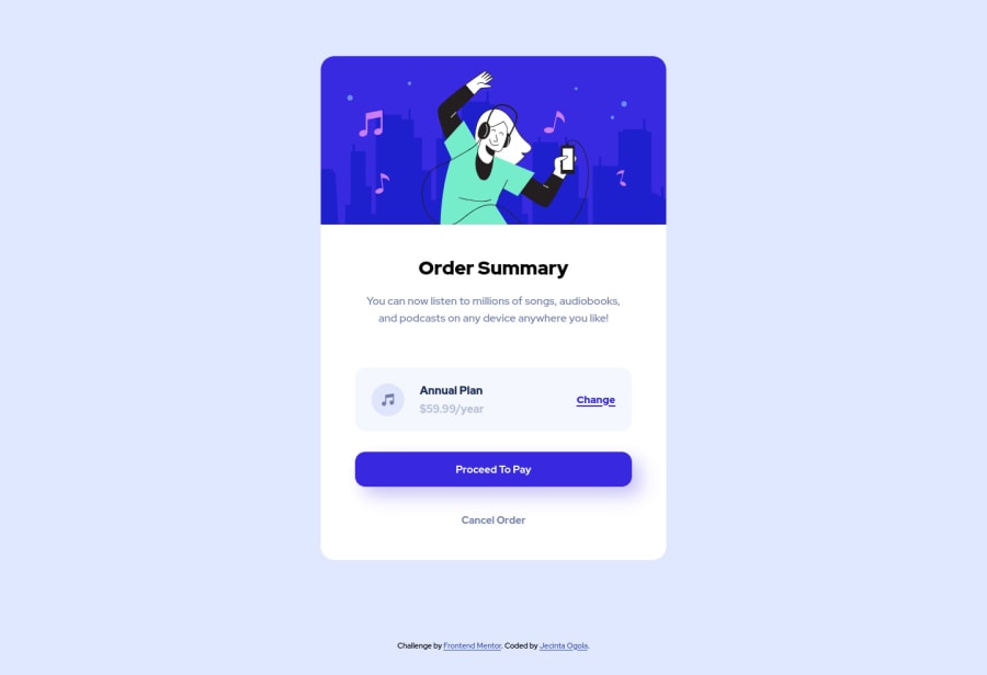
Hi guys, this is my first challenge after learning HTML and CSS. My desktop version does not display properly, the image is abnormally enlarged, but displays well when I run it from the local repo. I'll be glad to receive any feedback to improve my visual design. Thanks.
Community feedback
- @chetanhaobijamPosted about 3 years ago
For Accessibility Issues, use HTML5 semantic tags like main instead for div and footer instead of the last div which has .attribution class. Nest the div tags under semantic elements. Give the body "display: flex" property and "flex-direction: column" to avoid the attribution div overlapping the container block. And on desktop viewport, the container is too large. Limit the width of the container by using "max-width" CSS property. Other than that, your design is good. Keep it up.
Marked as helpful1 - @ogolajecintaPosted about 3 years ago
Thank you Haobijam for the feedback. Really means alot.
1
Please log in to post a comment
Log in with GitHubJoin our Discord community
Join thousands of Frontend Mentor community members taking the challenges, sharing resources, helping each other, and chatting about all things front-end!
Join our Discord
