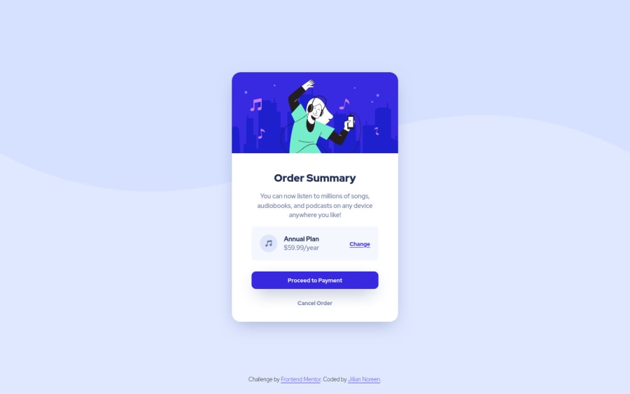
Design comparison
Solution retrospective
I would love any feedback or suggestions to improve my code. Thank you in advance!
Community feedback
- Account deleted
Hello there! 👋
Congratulations on finishing your challenge! 🎉
I have some feedback on this solution:
-
add cursor pointer to button so that the user knows its clickable
-
add tranistion:1s; to the button so that when you hover on the button the background changes smoothly
i hope this is helpful and goodluck!
Marked as helpful0@jilliannoreenPosted about 3 years ago@Old1337 Hi! Thank you so much for the feedback. I've made the changes you suggested, and I think it looks better now. Thanks again for the help!
1 -
- @Deevyn9Posted about 3 years ago
Hi Jillian,
The build itself is perfect, it has no issues. However, the attribution can be made to appear below the div which would make it look better
0
Please log in to post a comment
Log in with GitHubJoin our Discord community
Join thousands of Frontend Mentor community members taking the challenges, sharing resources, helping each other, and chatting about all things front-end!
Join our Discord
