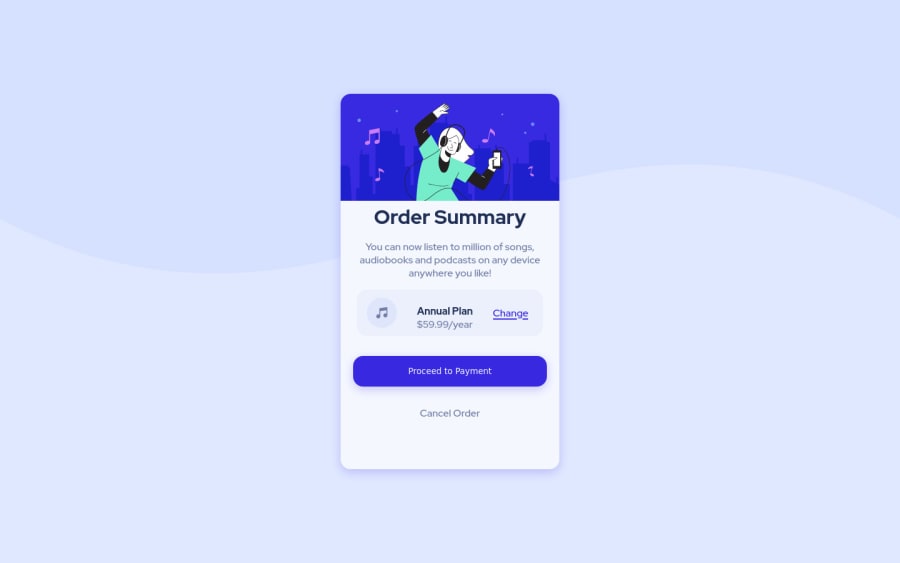
Design comparison
SolutionDesign
Solution retrospective
Hello everyone, it's been a while since the last time I posted so I came back with a little project. I have a few questions and if possible I would like to hear your feedback, so:
- I tried to use the picture tag for the desktop and mobile images, but when I used it my container was pushed to the bottom left and I couldn't move it up. I was wondering what I did wrong? I would appreciate if you could show me how to use it.
- Can you explain to me when to use min-height and max-height?
- When I verify the responsiveness my content moves left and right, up and down. Can you tell me why is this happening? Lastly, I want to say a huge thank you and I wish you all a good day :)
Community feedback
Please log in to post a comment
Log in with GitHubJoin our Discord community
Join thousands of Frontend Mentor community members taking the challenges, sharing resources, helping each other, and chatting about all things front-end!
Join our Discord
