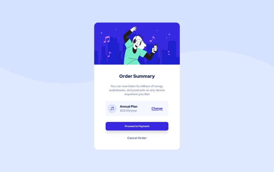
Design comparison
SolutionDesign
Solution retrospective
In this challenge I used new units for margin and font size to have better adaptability. I haven't even touched on responsiveness yet due to lack of time, it's not my focus to improve that for now.
Any feedback is welcome.
Community feedback
Please log in to post a comment
Log in with GitHubJoin our Discord community
Join thousands of Frontend Mentor community members taking the challenges, sharing resources, helping each other, and chatting about all things front-end!
Join our Discord
