Design comparison
Solution retrospective
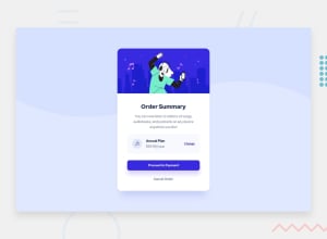
I am unsure about the drop-shadow values for the Order Summary Component as well as the drop-shadow value for the 'Proceed to Payment' button. The style guide said the font-size was 16px but I found that 14px matched the image more.
I used flexbox a lot for the Annual Plan button. I am unsure if there is a more elegant solution or if that's just what everyone does.
Community feedback
- @correlucasPosted about 2 years ago
👾Hello Robert, congratulations for your new solution!
Here's some tips for you:
Instead of using a
dateas a title for your page use a proper title. Do that inserting in the <head> the tag <title> →<title>Summary Component Card - Front End Mentor</title>The box-shadow is a bit too evident, this is due the
opacityandblur. The secret to create a perfect and smooth shadow is to have low values foropacityand increaseblurtry this value instead:box-shadow: 12px 7px 20px 6px rgb(57 75 84 / 8%);.card { width: min(375px, 100%); border-radius: 1rem; background-color: white; box-shadow: 12px 7px 20px 6px rgb(57 75 84 / 8%); }If you’re not familiar to box-shadow you can use this site to create the shadow design and then just drop the code into the CSS: https://html-css-js.com/css/generator/box-shadow/
✌️ I hope this helps you and happy coding!
Marked as helpful0
Please log in to post a comment
Log in with GitHubJoin our Discord community
Join thousands of Frontend Mentor community members taking the challenges, sharing resources, helping each other, and chatting about all things front-end!
Join our Discord
