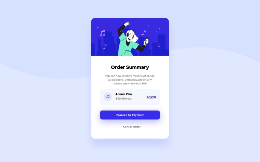
Design comparison
Solution retrospective
Your feedback is very welcome. I'm not satisfied with the mobile version because the card is not centred inside the body. Maybe there is anyone who can help. Much appreciated!
Community feedback
- @AdrianoEscarabotePosted about 2 years ago
Hi TayAki79, how are you?
I really liked the result of your project, but I have some tips that I think you will enjoy:
To prevent the background image from breaking at higher resolutions, we can prevent this in two different ways:
-
Add a
background-repeat: repeat-x;
, the image will repeat on the horizontal axis, preventing it from breaking. -
Add a
background-size: 100% 50vmin;
, the50vmin
will set its height as the page target, and100%
will make it stretch on the horizontal axis.
Feel free to choose one of the two!
The rest is great!
I hope it helps... 👍
0@TayAki79Posted about 2 years ago@AdrianoEscarabote Hi, Adriano. Thanks for your feedback. But to be honest I don't understand what you mean by not breaking at higher resolutions. I'm very sorry. I am a bloody beginner. I copy and paste one property you recommend to the image selector but I don't see any difference ; (
Thx for your great support, Adriano!!!
0@AdrianoEscarabotePosted about 2 years ago@TayAki79 when you open devtools and stretch the page, you might notice that the background image was breaking!
0@TayAki79Posted about 2 years ago@AdrianoEscarabote ah ok. I get it. You mean when I resize that there’s no abrupt change at the breaking point. Thx man
0 -
Please log in to post a comment
Log in with GitHubJoin our Discord community
Join thousands of Frontend Mentor community members taking the challenges, sharing resources, helping each other, and chatting about all things front-end!
Join our Discord