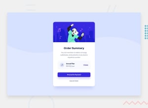
Design comparison
SolutionDesign
Solution retrospective
How should I improve the appearance? What should I do to make the code easier to read and edit?
Community feedback
- @Manas2403Posted about 3 years ago
hi @Taro2211
Give margin between proceed to payment and cancel order buttons . Give body height :100% and html also 100% to center the content . increase the font-size of cancel order a little more as it gives a better look in my opinion.Marked as helpful0@Taro2211Posted about 3 years ago@Manas2403 thanks you, your feedback is very useful. I'll definitely try it out.
0 - @CyrusKabirPosted about 3 years ago
hello my dear friend ♥ you did good and clean at all but here some problems :
- try change the main width of card i mean add it some number to it like (350 or 340)
- add some padding (in left and right) to summary class
- add some transition to buttons and give them some soul !!!
- you are try use "Red Hat " font but there is no @font-face or @import or something for defining font how you want to use it !!!
- your card heading (order summary) it's not black it's something like #1f2f56;
Marked as helpful0@Taro2211Posted about 3 years ago@CyrusKabir thanks for your feedback, I really appreciate it. This will surely improve my code a lot
0
Please log in to post a comment
Log in with GitHubJoin our Discord community
Join thousands of Frontend Mentor community members taking the challenges, sharing resources, helping each other, and chatting about all things front-end!
Join our Discord
