Design comparison
Solution retrospective
Feedback on layout and accessibility best practices would be appreciate.
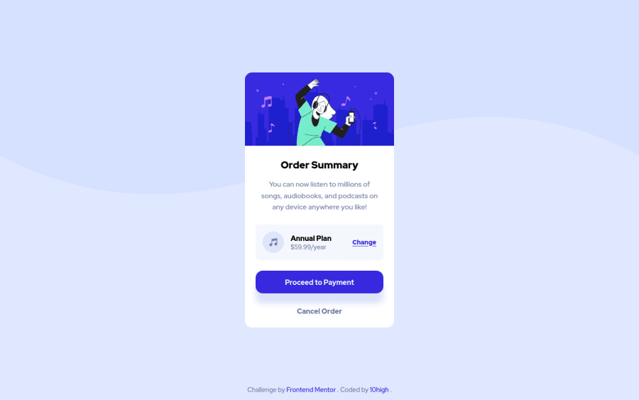
I would be particularly interested in feedback on how I've styled the layout for the "Annual Plan" section in the middle.
Thanks :)
Community feedback
- @FluffyKasPosted over 2 years ago
Hey there,
Your solution looks great, well done ^^ There only a few small things you could perhaps improve:
-
The
max-widthon the card could be 2-3 rems more. -
I don't think it's necessary to wrap the payment and the cancel order buttons in a
form. It's not really a form, a div will do the job. Sometimes a simpler solution works better ^^ -
For the "Annual Plan" text you could choose a different heading level than what you used for the "Order Summary". Right now, they're both
h2but they should be logically different. -
There's an unnecessary 100%
widthon themainelement. Nothing changes if you remove it. In the same place, you should swap theheightwithmin-height: 100vh, for responsiveness.
Apart from all these, you did good, the styling looks fine - Annual Plan section included! Happy coding ^^
Marked as helpful0@10highPosted over 2 years agoThanks for the detailed feedback @FluffyKas - that's really useful.
0 -
- @NaveenGumastePosted over 2 years ago
Hello 10high ! Congo 👏 on completing this challenge
Let's look at some of your issues, shall we:
-
As per the preview i can see that button shadow is more in your solution that there original design so maybe reduce it a bit
-
Wrong
font-weightfor "Change"
happy Coding😀
0 -
Please log in to post a comment
Log in with GitHubJoin our Discord community
Join thousands of Frontend Mentor community members taking the challenges, sharing resources, helping each other, and chatting about all things front-end!
Join our Discord
