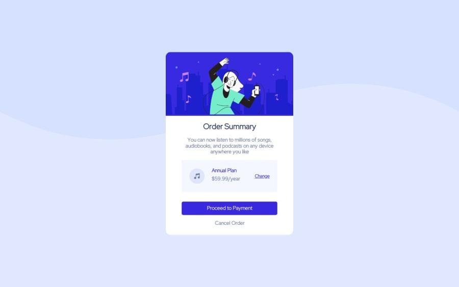
Design comparison
Solution retrospective
Hey! Could you give me your feedback please? I did this project some time ago, but only now am I uploading it to the platform and I am resuming my studies on Web tools.
Community feedback
- Account deleted
Hi Lucas, congrats for finishing this project, it look great 🥳
First thing first, about the design of the component :
-
Box shadows on the main card and the payment are missing.
-
Main background image have some issue, we can see a little empty space underneath it.
-
Font weight variations, line-height variation and also font-color variation are missing.
About the code itself, the files organization is really clean, that's great. I can find some improvements you can made :
-
Use GoogleFont instead of adding the font in your project locally, add it to your project with
<link>in your index.html, you will be able to import all the font weight variations you also need. -
Don't use absolute position on your main component, try to use Flexbox or Grid. Absolute need to be used when it's really needed on small details or element.
-
Rely more on Grid/Flex as they provide powerful and flexible ways to arrange elements without relying heavily on fixed dimensions. Fixed values can lead to layout issues.
-
Consider using max-width and max-height properties with relative units like percentages. This will prevent the content from overflowing its container and maintain aspect ratios.
-
Avoid using px and use relatives units instead like REM or EM, you used them well on the font-size 😉
I didn't understand why JS were needed here, it's also minified so hard to read and I can't give you a review.
If you have any questions, don't hesitate !
Have a nice day 😇
0 -
Please log in to post a comment
Log in with GitHubJoin our Discord community
Join thousands of Frontend Mentor community members taking the challenges, sharing resources, helping each other, and chatting about all things front-end!
Join our Discord
