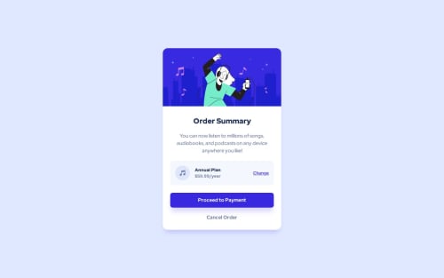
Submitted over 2 years agoA solution to the Order summary component challenge
Order Summary Card with Tailwind CSS
accessibility, tailwind-css, semantic-ui
@Luzefiru

Solution retrospective
I just learned about Tailwind CSS and decided to dip my toes into the workflow of doing Mobile-First Design.
Am I missing any best practices? I add the prescribed design system elements inside the tailwind.config.js and use the corresponding utility classes to use them.
Also, is my code semantically-ok? I made my title an <h2> because I'm assuming a <header> logo with an <h1> might be present in the website this component will be used.
Code
Loading...
Please log in to post a comment
Log in with GitHubCommunity feedback
No feedback yet. Be the first to give feedback on Luzefiru's solution.
Join our Discord community
Join thousands of Frontend Mentor community members taking the challenges, sharing resources, helping each other, and chatting about all things front-end!
Join our Discord