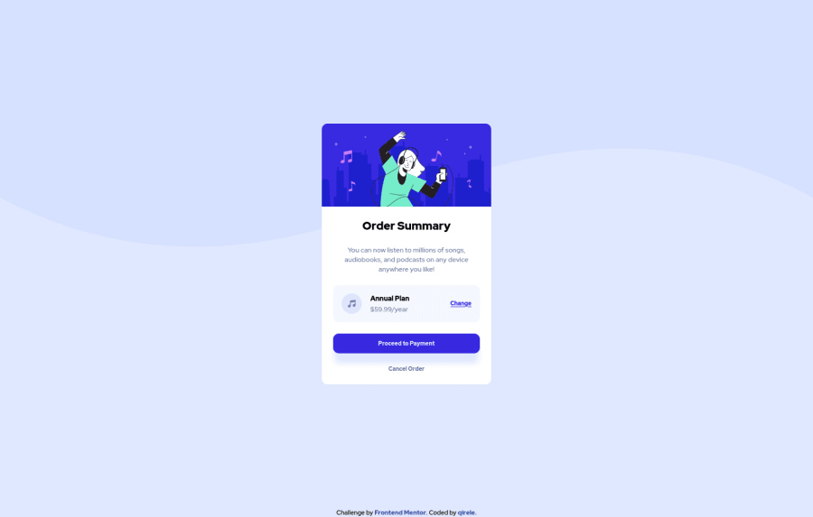


Design comparison
SolutionDesign

Solution retrospective
What do you guys think about using flexbox whenever you need to align something vertically or horizontally? I feel like I overused it in this page.
Community feedback
- @denieldenPosted almost 3 years ago
Hi Kiril, good work!
For me flexbox is the best way to align and have excellent control of the elements in the shortest possible time.
I had a look at your solution and I have a few suggestions for you:
bodyneed flex for align the card:height: 100vh; display: flex; align-items: center; justify-content: center;- in this case
maindoes not need flex,marginandheightbut needdisplay: block sectiondoes not need flex you can manage spaces viapadding
You did well overall ;)
Hope this help
0

Please log in to post a comment
Log in with GitHubJoin our Discord community
Join thousands of Frontend Mentor community members taking the challenges, sharing resources, helping each other, and chatting about all things front-end!
Join our Discord