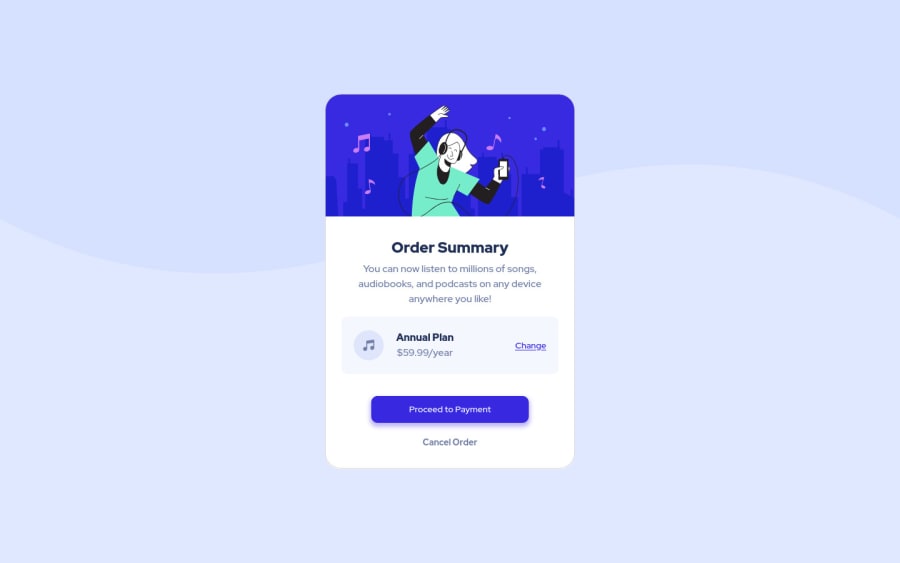
Order summary card with html, css and bootstrap 5
Design comparison
Solution retrospective
I'm waiting feedbacks from you
Community feedback
- @MusreadPosted over 1 year ago
Hi Hasan 🙂 !
I'm impressed with your solution ! This a great work !
I was looking at your code and I have some little suggestions that may improve your skills at coding great web interfaces.
# 1st suggestion
The first suggestion is about the image's borders in the top of the card. Indeed, you used the
border-radius
property like this :.card{ width: 400px; height: auto; border-radius: 25px; } picture { border-radius: 25px; margin-bottom: 10px; } picture img{ width: 100%; border-top-left-radius: 25px; border-top-right-radius: 25px; }
That is great, because this is exactly what we need to have shaped borders. But, as developers, it's important to think about the don't repeat yourself philosophy.
Maybe you've already heard this expression which makes somebody looks like a genius 😂, but it's very simple to understand.
In the code above, you used the
border-radius
property in three places. But if somehow you need to change the value to 20px, you will have to change it three times : in.card
,picture
and.picture img
. This is easy here. But imagine for big projects in which you have multiples files and folders and you used a CSS property in 35 different places. The day you will need to change it, you will have to do it 35 times 😅.So, I would suggest this code :
.card{ width: 400px; height: auto; border-radius: 25px; overflow: hidden; } picture { margin-bottom: 10px; } picture img{ width: 100%; }
In HTML, when an element inside another one is bigger, it will 'overflow' it. Than means the part that is too big to fit in will be visible. But what's cool is that you can decide to hide that visible part, hence the declaration
overflow: hidden
. So with this solution, you will only need to change the borders for the.card
. You can find more explanation in Mozilla documentation there.# 2nd suggestion
The last suggestion I want to give is about the layout.
When you look closely at the design, the buttons and the rest of the content should have the same lenghts. But in your solution, the buttons are smaller than the rest of the content. Of course, you can chosse to put the same width for
.card-btn
and.card-text
. But as I mentioned before : don't repeat yourself 😄.What I suggest her is to put your
.card-btn
element inside the.card-text
element. Then you can remove theplace-items
, so the element will automatically occupy the available width..card-content .card-btn{ display: grid; /* So `.card-btn` will occupy all the width by default */ /* place-items: center; */ }
All you need to do if you want to modify the width is to play with the
padding
of your.card-content
element 🙂.That's it for me !
I hope I dind't bother you with all that explanation 😂. I try my best to explain what I've learned, so feel free to ask questions if you want.
I made a pull-request on your GitHub repo so you can check out the modification I've made.
Bye 🖐 !
Marked as helpful0@hsyigitogluPosted over 1 year ago@Musread Oh hello. Thank you for suggestions. I'm new on GitHub and FrontendMentor. So I'm learning how i will use those sites. I hope so i wasn't do antyhing wrong.
0@MusreadPosted over 1 year ago@hsyigitoglu Hello ! I'm glad you manage to merge my suggestion on GitHub. Don't worry, I'm also new on FrontendMentor, and to be honest, I was struggling at writing you a comment 😂
1
Please log in to post a comment
Log in with GitHubJoin our Discord community
Join thousands of Frontend Mentor community members taking the challenges, sharing resources, helping each other, and chatting about all things front-end!
Join our Discord