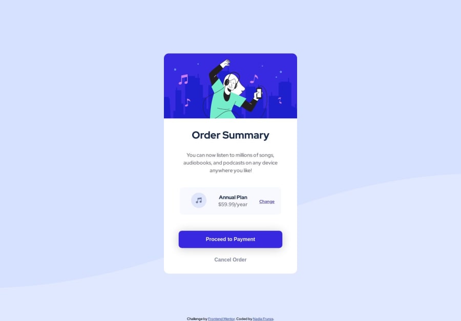
Design comparison
Solution retrospective
My 3rd completed challenge on this website! As usual, any feedback is welcome!
What went well?
Glad I remembered that I can assign multiple classes, so it made my code less cumbersome in some parts.
Which areas of your code are you unsure of?
From the start, I had issues with the background image. I sent it to cover, but it turned out too big for some reason. Probably because of that, my card was placed too low on the page. To fix that, I applied a negative margin-top, but I don't think this is a good practice. I tried flex-start property, but it didn't help. How can I change this?
Help with responsive mode.
Instead of media queries, I decided to experiment with clusters. I followed this [video]: (https://youtube.com/shorts/GLB-JTYfa8M?feature=share) But it didn't work for me. Not sure what I did wrong, I thought it was an efficient idea, but maybe it wasn't right for my case. Will be interesting to know, is this a good practice or I should just stick to media queries?
Community feedback
Please log in to post a comment
Log in with GitHubJoin our Discord community
Join thousands of Frontend Mentor community members taking the challenges, sharing resources, helping each other, and chatting about all things front-end!
Join our Discord
