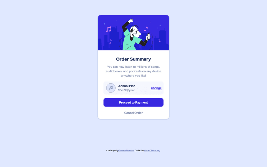
Design comparison
SolutionDesign
Solution retrospective
The hover color for the blue button proved challenging. I used the lighten($color, $amount) function in SASS to achieve it.
Kindly, draw my attention to anything I might have missed or can do to improve it. Thank you.
Community feedback
- @Davidmide02Posted over 2 years ago
You did well, but there's always room for improvement. Keep learning
0 - @denieldenPosted over 2 years ago
Hey Mases, congratulations on completing the challenge! You did a great job 😉
Let me give you some little tips for optimizing your code:
- For add the top image in the background just put more specific background properties to the body:
background: url("../img/pattern-background-desktop.svg") no-repeat top center; background-size: contain; background-color: #e0e8ff;- add
transitionon the element with hover effect - instead of using
pxuse relative units of measurement likerem-> read here
Hope this help! Happy coding 😁
0@sajjadnazaridevPosted over 2 years ago@denielden You said a good point To create a shadow, it is better to use the Box-shadow tag in style
0
Please log in to post a comment
Log in with GitHubJoin our Discord community
Join thousands of Frontend Mentor community members taking the challenges, sharing resources, helping each other, and chatting about all things front-end!
Join our Discord
