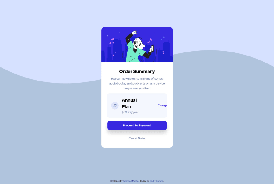
Design comparison
Solution retrospective
It took 3hrs for me to built it. How about you guys? Please feel free to comment . Thank you.
Community feedback
- @Bayoumi-devPosted almost 3 years ago
I suggest you center the component on the page by giving the parent element
<main>the following properties:main { display: flex; justify-content: center; align-items: center; min-height: 100vh; }I think you forget to set the background... set it up,
background-image: url(../images/pattern-background-desktop.svg);Marked as helpful1@grgrockyPosted almost 3 years ago@Bayoumi-dev Thanks mate for your kind suggestions. I did it like you said. It worked. But even after 'Generating Screenshot' the issues reports are still the same. I don't know why, may be I'm not a pro member. However, Thanks for your time.
Cheers
0 - @Bayoumi-devPosted almost 3 years ago
Hey Rocky Gurung, Congratulations on completing this.
- It looks great! but you have some
issuesyou need to fix. Heading levels should only increase by one, Changeh3toh2Document should have one main landmark, Contain the component in `<main>.
<main>
   <section id="container">
      //...
   </section>
</main>
Keep coding👍
Marked as helpful0@grgrockyPosted almost 3 years ago@Bayoumi-dev thanks Ahmed for pointing out the issues and your kind suggestions.
Cheers
0 - It looks great! but you have some
Please log in to post a comment
Log in with GitHubJoin our Discord community
Join thousands of Frontend Mentor community members taking the challenges, sharing resources, helping each other, and chatting about all things front-end!
Join our Discord
