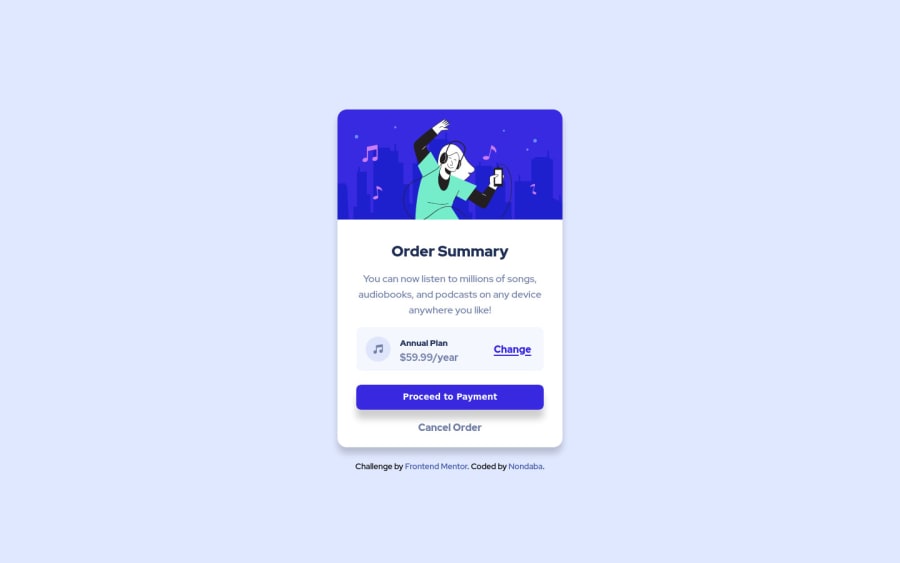
Order summary card with active state built using CSS and HTML
Design comparison
Solution retrospective
I found the active state to be hard due to the hover color that was supposed to be on the button and the change link which was not given in the style guide. Is my color for the button and change link in the active state accurate? Did I depict similar shadow of the card and button?
Community feedback
- @AatypicPosted about 2 years ago
Hello and congratulations on your solution!
Concerning your question, yes the color for the effect is not in the style guide. But from what I understand is that it's the same color with less opacity something like .7
hsl(245deg 75% 52% / 70%)Yes the shadow of the button is maybe too big but that's personal preference. Or if you space it out more and give more size to the price/plan bubble to make it stand out better 🤷♂️
Anyway this is great stuff.
Good luck ✌️
1@NondabaPosted about 2 years agoHi @Atypical , thanks for the suggestions. Will make sure to take it under advisement.
0
Please log in to post a comment
Log in with GitHubJoin our Discord community
Join thousands of Frontend Mentor community members taking the challenges, sharing resources, helping each other, and chatting about all things front-end!
Join our Discord
