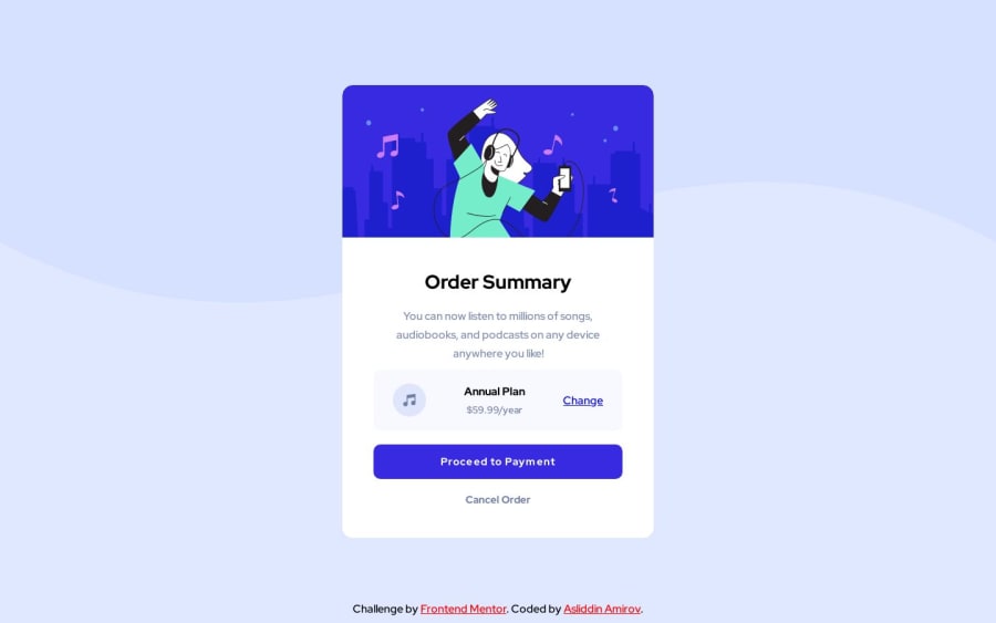
Design comparison
SolutionDesign
Solution retrospective
6th challenge is done on 6th Day👊!
Post your feedback on this project🙃
Community feedback
- @NoxlobinPosted about 1 year ago
Hi 👋 I have seen some errors in your CSS.
- Your background should have
background-size: coverin your css in order to actually not make it stuck to one side. - I recommend you not adding a width since you are using
justify-content: center. Therefore, don't useflex-directionas it is not necessary here. - You used a different color for the hover effect. Try using
hslaand adjust the alpha (meaning opacity of the color).
1 - Your background should have
Please log in to post a comment
Log in with GitHubJoin our Discord community
Join thousands of Frontend Mentor community members taking the challenges, sharing resources, helping each other, and chatting about all things front-end!
Join our Discord
