Submitted about 2 years ago
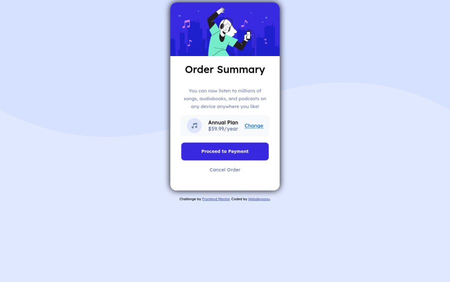
Order summary card using only HTML, CSS , flexbox
@Webdevsonu
Design comparison
SolutionDesign
Solution retrospective
Any feedbacks are welcome. It was easy to build this card but I had some confusion that for the below two buttons should I use <a> tag or button, In which case is better to use a button than <a> tag or vice versa.
Community feedback
- @fazzaamiarsoPosted about 2 years ago
Hi Webdevsonu!
In real implementation, you would want to use
<a>tag whenever you want to go to other page (changes url) or linked header. Example: navigation in header that leads to page, such as about, contact.Button can be used for interactivity within a page. Example: form submission button, dropdown button, post feedback button.
I hope it helps, Cheers!
Marked as helpful0
Please log in to post a comment
Log in with GitHubJoin our Discord community
Join thousands of Frontend Mentor community members taking the challenges, sharing resources, helping each other, and chatting about all things front-end!
Join our Discord
