Design comparison
Community feedback
- @AminviPosted about 2 years ago
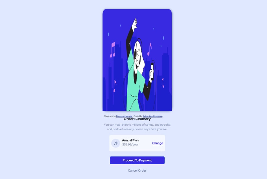
i have no idea why it is looking weird on front end mentor but when the site is previewed it looks good !!!!! can anyone please give a good reason for me
0 - @correlucasPosted about 2 years ago
👾Hello @Aminvi, Congratulations on completing this challenge!
🎨 Here are some tips to improve your component design:
The background wave image is missing and here’s the step-by-step to add it.First of all add the image as a background inside the
bodythis is the code for that:background-image: url(../images/pattern-background-desktop.svg);Then you add
background-repeat: no-repeatto avoid the background repeating andbackground-size: containto make it fit full width and center with the card this is the best choice, but an alternative to resize it is to usebackground-size: 125%,body { background-size: contain; background-image: url(./images/pattern-background-desktop.svg); background-repeat: no-repeat; }✌️ I hope this helps you and happy coding!
0
Please log in to post a comment
Log in with GitHubJoin our Discord community
Join thousands of Frontend Mentor community members taking the challenges, sharing resources, helping each other, and chatting about all things front-end!
Join our Discord
