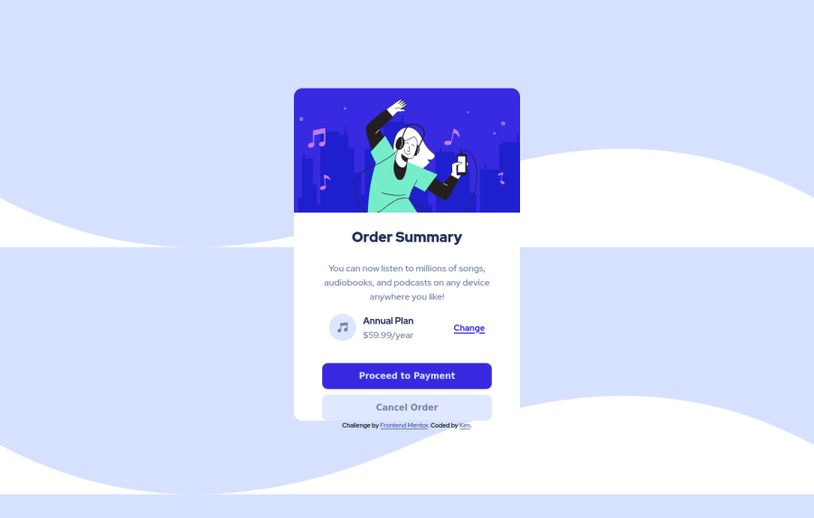
Design comparison
SolutionDesign
Solution retrospective
This is my second challenge here and I'm really glad to finish this one. Only one setback is as I deployed this one through 'Github pages', I happened to apply a theme to the website and it kind of makes this website pretty ugly. Apart from that it is okay I guess. Kindly provide any feedback on how to improve.
Community feedback
- @darryncodesPosted about 3 years ago
Hi Ken,
Nice solution, well done on finishing it!
You could consider:
- adding some wide space in the form of
margin-bottomat the bottom of the card so the cancel order button has some breathing space - also try this on your background:
background-size: 100% auto;
background-repeat: no-repeat;
background-color: hsl(225, 100%, 94%);
Marked as helpful1@DummyKenPosted about 3 years ago@darryncodes Hey Darry! Thank you for providing this valuable feedback on my project. Thanks I will fix it asap.
0 - adding some wide space in the form of
Please log in to post a comment
Log in with GitHubJoin our Discord community
Join thousands of Frontend Mentor community members taking the challenges, sharing resources, helping each other, and chatting about all things front-end!
Join our Discord
