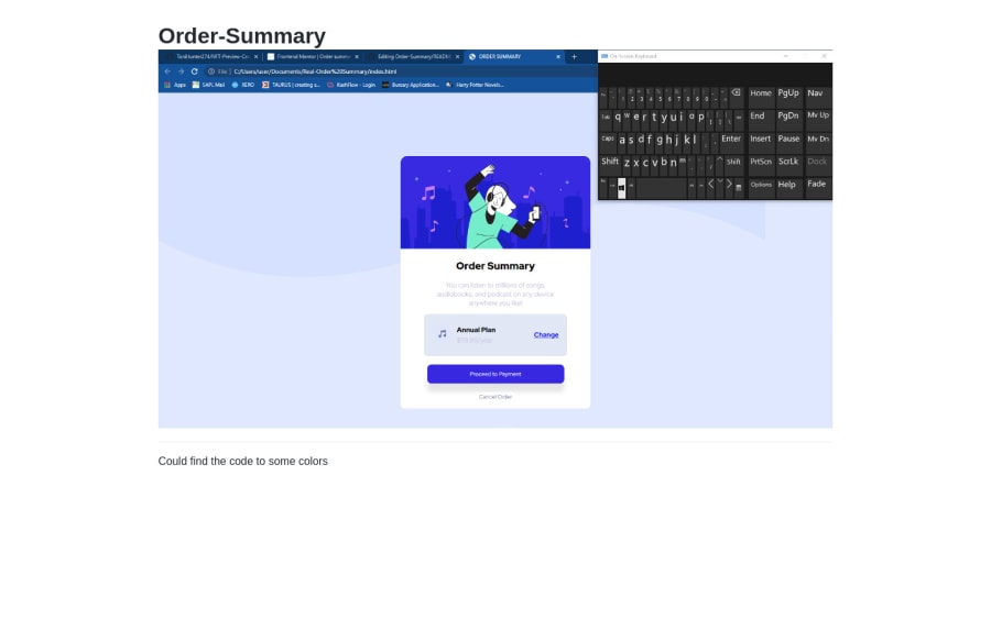
Order Summary Card using HTML and CSS
Design comparison
Solution retrospective
Did I do well? How can i improve?
Community feedback
- @NaveenGumastePosted almost 3 years ago
Hay ! Good Job you made it look nearly perfect to the preview
These below mentioned tricks will help you remove any Accessibility Issues
-> Add Main tag after body like it should be your container
-> For 1st heading or h1 tag, use header tag and then inside the header put your h1 or h2 etc
-> But use header tag only once in main heading element.
Keep up the good work!
Marked as helpful1@ToniHunter274Posted almost 3 years ago@Crazimonk Thanks you for the suggestions..would work on those.
0 - @adityas24Posted almost 3 years ago
Hey Oluwatoni, upload your code again.
Your folder structure is not proper. Index.html file should be in the root folder.
All the best 🙂👍
Marked as helpful0@ToniHunter274Posted almost 3 years ago@adityas24 Thank you..would work on that.
0@ToniHunter274Posted almost 3 years ago@adityas24 Hello again, just tried to do what you said but I don't understand, Do i upload the HTML and CSS codes in the Read.me file?
0@adityas24Posted almost 3 years ago@ToniHunter274 Problem is with your folder structure.
Instead of looking like this https://paste.pics/FU0B1
Your folder structure should simply look like this https://paste.pics/FU0BW
Your index.html file should be in the root folder. I will advice you to watch a short tutorial on youtube again on how to host website on github to know correct folder structure.
All the best 🙂👍
0
Please log in to post a comment
Log in with GitHubJoin our Discord community
Join thousands of Frontend Mentor community members taking the challenges, sharing resources, helping each other, and chatting about all things front-end!
Join our Discord
