Design comparison
Community feedback
- @LfrancosPosted almost 3 years ago
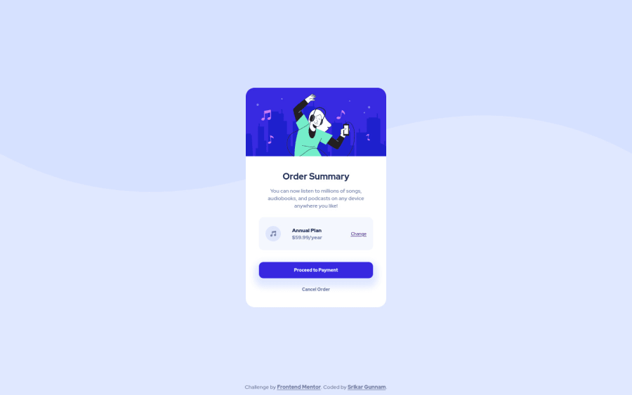
Hi @srikargunnam I really like what you have here. One of the things that I was struggling with and I see that you also have that problem is when you push the height of this project to an extreme the middle top of the card is getting lost and there is no way to look at what you have there. I highly encourage you to change the "height" that you have in your main tag to "min-height" that would help solve that problem.
Also I'm taking a look at your report and I can see that you have 2 "h3" titles on the same section, with titles the recommended thing is to not use the same heading 2 times. I would recommend to change one to "h2" and change the looks in the CSS file. Keep in "h3" the one that you think is most important for the web page. Keep up the good work!!
Marked as helpful0@srikargunnamPosted almost 3 years agoHI Lorenzo Franco,
Thank you so much for helping me understand where i can improve myself.
I will make the necessary changes 🔧 and update the solution.
1
Please log in to post a comment
Log in with GitHubJoin our Discord community
Join thousands of Frontend Mentor community members taking the challenges, sharing resources, helping each other, and chatting about all things front-end!
Join our Discord
