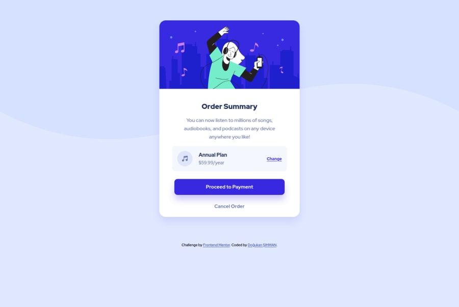
Design comparison
Solution retrospective
Hi there again! Sorry for the inconvenience. I made a mistake back then and it wasn't showing the right solution. I can say that I'm new around here, and can't spare much time for challenges but I'm trying my best. I've asked it before but gotta ask it again. How do you guys keep yourself motivated on coding knowledge? I feel like I'm really slow and couldn't learn much. And I know that I've wasted my time watching videos over and over and not doing many challenges, and frontendmentor's challenges are the best practice for overcoming this issue.
Community feedback
- @toprakunalPosted about 2 years ago
Hey Doğukan! When i think i'm slow and coudn't learn much and feel demotivated, i always remember the quote " Rome wasn't built in a day ". Just keep consistent and try your best, don't worry about being slow. Addition to that you may consider use media queries for mobile size background image. Keep it up!
Marked as helpful1@dogukan0055Posted about 2 years ago@toprakunal thanks for your encouraging words Toprak :) It means a lot ^^ And yeah you're right, I always forgot to add media queries and I really have some hard time when I try to figure out max-width and min-width, i always do the opposite :D
1 - @VCaramesPosted about 2 years ago
Hey @dogukan0055, great job on this project!
Some suggestions to improve you code:
-
To make CSS Variables (:root) easier to deal with, you can give the custom names, like "b--background", "button-color", etc...
-
To properly center your content to your page, add the following to your <body> element:
body { min-height: 100vhh; display: flex; flex-direction: column ; justify-content: center; align-items: center }
- While having interactive content (cards, links, icons, buttons, etc…) can definitely make content less static, if not done properly, it can actually have negative effect on your users experience. By simply just applying a “hover” effect to your content, you’re assuming that every device is compatible with “hover” effects. Unfortunately, most devices are not. To provide your users a better experience, you can use the @media (hover: hover) . Now users that that are devices that are not “hover” compatible will be able to enjoy your content.
Sources:
https://css-tricks.com/solving-sticky-hover-states-with-media-hover-hover/
Happy Coding!
Marked as helpful1@dogukan0055Posted about 2 years ago@vcarames Hello there m8! Thanks for your lovely comment and suggestions! Means a lot to me :) I've tried to add this CSS to the body element but I wasn't able to re-position the footer. Any suggestion on that? And yeah, I really need to think about the bigger piece. You're right, I'll work on that also. Thx!
0 -
Please log in to post a comment
Log in with GitHubJoin our Discord community
Join thousands of Frontend Mentor community members taking the challenges, sharing resources, helping each other, and chatting about all things front-end!
Join our Discord