Submitted over 2 years ago
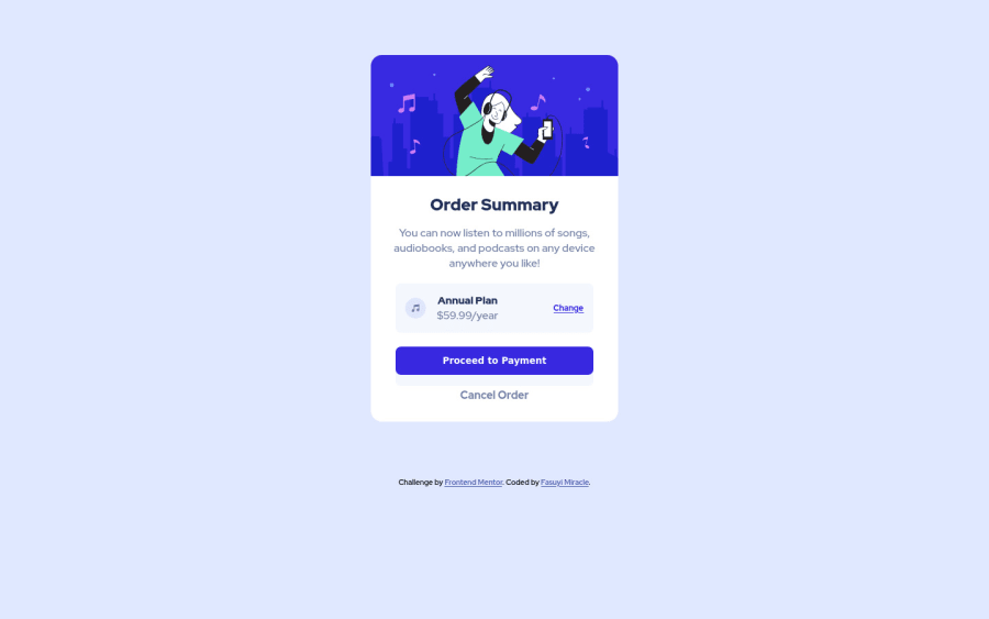
Order Summary Card using flexbox and custom css properties
@iammiracle01
Design comparison
SolutionDesign
Solution retrospective
Hi there, take a look at my order summary card solution and leave a feedback or review.Thanks
Community feedback
- @hrk-berserker27Posted over 2 years ago
Hi there, you did a great job. Following are some suggestions that you can incorporate into your solution:
- Don't use the paragraph tag inside the span tag as it has the semantic meaning associated with it and refers to a paragraph. For further reading: "https://stackoverflow.com/questions/1908234/when-to-use-span-instead-p#:~:text=We%20actually%20use%20span%20element,has%20semantic%20meaning%20in%20HTML" try checking this on stack overflow.
- Try adding the attribution in the footer tag and putting it inside the main tag. It will remove the main landmark accessibility issue. For further read, check this: "https://www.w3.org/WAI/ARIA/apg/example-index/landmarks/main.html#tabpanel1". You can also add a different label and add the attribution in a different main tag with the "aria-labeled by" attribute with unique labels for each main tag as suggested in the article link above.
Marked as helpful0
Please log in to post a comment
Log in with GitHubJoin our Discord community
Join thousands of Frontend Mentor community members taking the challenges, sharing resources, helping each other, and chatting about all things front-end!
Join our Discord