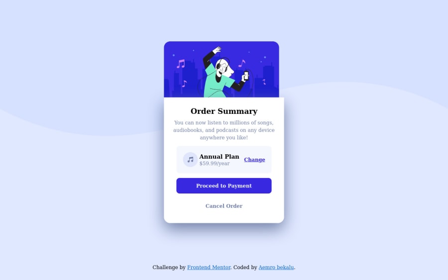
order summary card using css grid and flexbox
Design comparison
Solution retrospective
how can I make more responsive this site?
Community feedback
- @NaveenGumastePosted over 2 years ago
Hay ! AYUSH Good Job on challenge
These below mentioned tricks will help you remove any Accessibility Issues
-> Add Main tag after body
<main class="container"></main>
-> Learn more on accessibility issues
If this comment helps you then pls mark it as helpful!
Have a good day and keep coding 👍!
Marked as helpful0 - @RioCantrePosted over 2 years ago
Hello there! Nice work in this project. Viewing at your solution, I would suggest the following for you...
- Remove
margin-left: 30px;
in theattribution
and addtext-align: center;
. Adjust the padding intopadding: 1rem;
- Add
background-color: hsl(225, 100%, 94%);
in thebody
tag. Remove it on thecontainer
- Add background color for the
.continue:hover
rule set - Wrap the whole content of
container
with specific tag likemain
andattribution
withfooter
tag for readability. To know more, refer it with Semantics - Include description with the
alt
inimg
tags - Clean the whitespaces in the code
Overall, you did well with the media queries, it's optional to not include it for a simple project like this. Hope this helps and Keep up the good work!
1@aemrobePosted over 2 years agothanks very much Rio but I want to ask you one question. the design that I preview on my browser and after i submitted and look it on the comparision are not the same what is the problem I will be glad if I can hear what is the problem.
0@RioCantrePosted over 2 years ago@aemrobe The design comparison captures the screenshots of a specific breakpoints, however, if you become a PRO member, you have access to unlimited solution screenshots.
- Unlimited solution screenshots - Make sure your solution is being shown in its best light with unlimited screenshots. If you make changes to your project, you can generate new screenshots so that the design comparison is showing the latest version of your project.
Once your a PRO member, under the design comparison part, there will be a button with
Generate Screenshot
, click on it to get updated screenshot versions of your solution.Marked as helpful1@aemrobePosted over 2 years ago@RioCantre thanks so it isn't the problem of mine, anyone who is interested in seeing can preview it and see the real ones which I also watched on my browser
1@RioCantrePosted over 2 years ago@aemrobe However, it's best to have a good screenshots of your projects or else anyone who seen the screenshot is not looking great would not have the time to click the
Preview Site
button.0@aemrobePosted over 2 years ago@RioCantre huh so the screenshot which is seen on my solution is the one which i captured and added to my project, I didn't know this before . I thought that they caputred it for me or some software.
0 - Remove
Please log in to post a comment
Log in with GitHubJoin our Discord community
Join thousands of Frontend Mentor community members taking the challenges, sharing resources, helping each other, and chatting about all things front-end!
Join our Discord