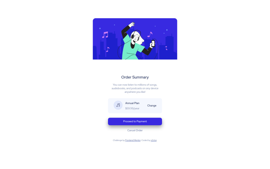
Design comparison
Solution retrospective
I used Flexbox in a single place (.content__order__plan__info) because I had no clue how to make it via grid. Does anyone have any tips?
Community feedback
- @pikapikamartPosted about 3 years ago
Hey, great work on this one. Though of course, background-image is currently missing and the other background-color, adding those would be really great so that there will be a visible boundary between the background and the main-component which is the card.
Some other suggestions would be:
- Avoid using
height: 100vh
on a large container like thebody
and on thehtml
tag as this makes the element's height capped based on the viewport/screen's height. Instead usemin-height: 100vh
so that the element will expand if it needs to. - Always have a
main
element to wrap the main content of the site. For this usemain
tag on the.container
selector. - When using
img
tag, do not forget to add thealt
attribute, whether the value is empty or not. Because by not including it, screen-reader will instead read the source path of the image which you don't want. So always include it. - Also, there are too much going on about
class
in here which you can have a workaround with. For example, you don't need those extradiv
contanier, you can just directly use something like:
<div> <h1>Title</h1> <p>Description</p> <div> <img src="" alt=""> #icon in here <div> <h2>Pricing</h2> <p>Pricing value</p> </div> <a href="">Cancel</a> </div> </div>
When wrapping up a text-content, make sure that it is inside a meaningful element like
p
tag or heading tag and not using likediv
to wrap the text.- Also always have an
h1
on your page, that is why on my suggested markup below, theorder summary
is usingh1
. - Same with the music-icon, include the
alt
attribute. - The
annual-plan
is a heading tag since it gives information about a section and that section is all about the annual pricing plan which is the value below it. - Also, I would put the
.attribution
outside of the.container
and be using afooter
tag on it so that it will be its own landmark. - Lastly, just the visual of the layout. Adding the background so that there will be visual-border like I said above.
Aside from those, great job still on this one.
Marked as helpful0 - Avoid using
Please log in to post a comment
Log in with GitHubJoin our Discord community
Join thousands of Frontend Mentor community members taking the challenges, sharing resources, helping each other, and chatting about all things front-end!
Join our Discord