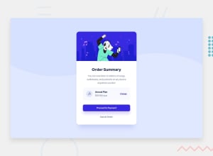
Design comparison
Solution retrospective
This is yet another time I can't get the shadows correct. Please help
Community feedback
- @MarlonPassos-gitPosted about 3 years ago
-
add to background
background-repeat: repeat-x -
In the mobile version it should have another background
-
In the original design, there are no borders and no leftovers on the card
-
It could have an effect on the buttons besides just changing the muse pointer, maybe a slight color or size change would be more interesting
-
the card's internal background is #FFF the way you can't even see the plan's backdround
-
The font size of the title is 28px
-
it's nice that you keep the readme of your project with information about things you learned doing this project
-
Otherwise it was cool, in the macro it was very similar to the final project
1@saifu-aPosted about 3 years ago@MarlonPassos-git Thanks for your feedback. I have incorporated the necessary changes you suggested.
0 -
Please log in to post a comment
Log in with GitHubJoin our Discord community
Join thousands of Frontend Mentor community members taking the challenges, sharing resources, helping each other, and chatting about all things front-end!
Join our Discord
