


@Islandstone89
Posted
Hi Nikola. I like that you include the <main> landmark, and use rem instead of px for font-size - well done!
Here are some suggestions I hope you find helpful.
HTML:
-
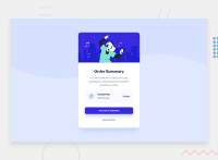
The image and the icon are decorative, hence their alt text should be empty:
alt="". -
Headings should always be in order, so you can never jump from a
<h1>to a<h4>. -
"Cancel Order" would likely trigger an action, so I would change it to a
<button>.
CSS:
-
It's good practice to include a CSS Reset at the top.
-
Add around
1remofpaddingon thebody, so the card doesn't touch the edges on small screens. -
Paragraphs have
font-size: 1remas their default, so you don't need to declare it explicitly. -
Remove all widths.
-
Add a
max-widthin rem on the card, so it doesn't stretch too wide on big screens. -
Remove
position: absolute, it is not needed. -
On the image, add
display: blockandmax-width: 100%- the max-width prevents it from overflowing its container. -
Don't use
%on margins. -
Media queries must be in rem, and it is common to do the mobile styling as the default.
Marked as helpful
