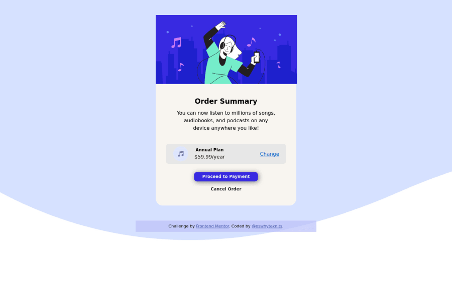
Design comparison
Solution retrospective
Hi all This is my first challenge, and I think I did pretty decent. all that aside, I can't figure out how to perfectly fit the main image inside the div. You can even see I haven't been able to show the top part of the container either. If anyone can help, I am ready for the feedback. Thank you.
Please log in to post a comment
Log in with GitHubCommunity feedback
- @thekindbard
you have to set border-radius to the image, like border-radius: 1em 1em 0 0; Another improvement is set :hover animation to the bottom.
Marked as helpful - P@kens-visuals
Hey @oswhyteknits 👋🏻
I have some suggestions to help you fix the accessibility issues and some other things.
- In your markup,
<div class="container">...</div>should be<main class="container">...</main>and<div class="attribution">...</div>should be<footer class="attribution">...</footer>. These will fix the accessibility issues. Don't forget to generate a new repot once you fix the issues. - Hero image should have a
display: block;, it removes the line underneath the image. If you want to know what's causing it, check out the 3rd section of this video. - Next, I suggest using
<h2>or<p>instead of<h5>, because headings in HTML have to increase gradually, such ash1, h2, h3…. - For the music icon, add
aria-hidden="true”, because it's for decoration. You can read more aboutaria-hiddenhere. To illustrate:
<img src="images/icon-music.svg" alt="" aria-hidden="true”>- In order to fix the
border-radiusjust addoverflow: hidden;to.container. - Also, I suggest implementing
:hoverstate, which you can find in design folderactive-stateimage, after you implement it you can also addtransition: all 0.2s;to the button and the links, this will make:hoversmoother. - Lastly, let's bring the card to the center of the screen, so I made a couple of changes in
body:
body {
    background-image: url(images/pattern-background-desktop.svg);
    font-family: Helvetica, sans-serif;
    font-size: 16px;
    text-align: center;
    margin: 0;
    width: 100%;
    background-repeat: no-repeat;
    background-size: contain;
    min-height: 100vh;
    display: flex;
    flex-direction: column;
    align-items: center;
    justify-content: center;
    background-color: #e0e8ff;
}
I hope this was helpful 👨🏻💻 other than that, you did a great job for the first project, keep it up. Cheers 👾
- In your markup,
Join our Discord community
Join thousands of Frontend Mentor community members taking the challenges, sharing resources, helping each other, and chatting about all things front-end!
Join our Discord
