Design comparison
Community feedback
- @VCaramesPosted about 2 years ago
Hey @K-Muzslay, some suggestions to improve you code:
-
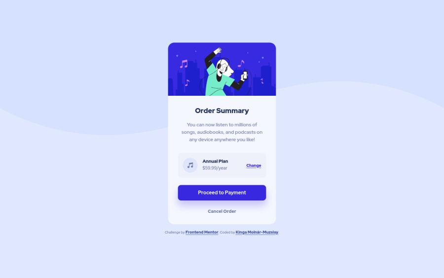
The “Illustration” and Music Icon serves no other purpose than to be decorative; It adds no value. The Alt Tag should left blank and have an aria-hidden=“true” to hides it from assistive technology.
-
There is only one heading this challenge and that is the ”Order Summary".
-
Your "button" was created with the incorrect element. When the user clicks on the button they should directed to a different part of you site. The Anchor Tag will achieve this.
-
Your content is not fully responsive. Here is a link to Google Developer’s site that will teach you how make it 100% responsive:
Happy Coding! 👻🎃
Marked as helpful0@K-MuzslayPosted about 2 years ago@vcarames Thank you very much for your feedback. It will help me to fix those issues in the future.
0 -
Please log in to post a comment
Log in with GitHubJoin our Discord community
Join thousands of Frontend Mentor community members taking the challenges, sharing resources, helping each other, and chatting about all things front-end!
Join our Discord
