Submitted about 3 years ago
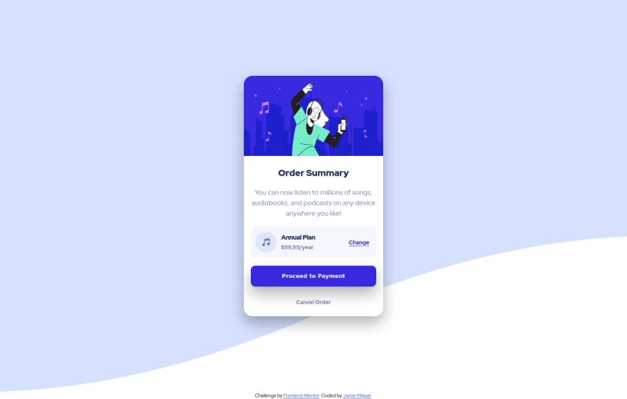
"Order Summary Card" solution, desktop-first using CSS grid and flex
@notFaceroll
Design comparison
SolutionDesign
Solution retrospective
any tips for a beginner are welcome :)
Community feedback
- @pikapikamartPosted about 3 years ago
Hey, awesome work on this one. Layout in general looks great, just needed for it to be a bit bigger like on the design.
Some other suggestions would be:
- Always have a
main
element to wrap the main content of the site. For this usemain
tag on the.container
selector. - Avoid using
height: 100vh
on a large container like the.container
as this makes the element's height capped based on the viewport/screen's height. Instead usemin-height: 100vh
so that the element will expand if it needs to. - On the
.container
using these stylings makes the background-wave looks more like on the design:
background-repeat: no-repeat; background-position: top; background-size: 100%; background-color: hsl(225, 100%, 94%);
- The
.attribution
should be usingfooter
so that it will be inside a landmark element as well. - The vector/image inside the card is just a decorative image. Decorative images should be hidden for screen-reader at all times by using
alt=""
andaria-hidden="true"
to theimg
tag or onlyaria-hidden="true"
if the image is usingsvg
. - Only use descriptive
alt
on images that are meaningful and adds content to the site otherwise hide the image for screen-reader users. - The "order-summary" could have use a heading tag, like an
h1
for now since it gives information on what the sections would contain. - The music-icon is only decorative so hide it using the method above.
- The "annual-plan" could use a heading tag as well like an
h2
since it describes the section. - When wrapping up a text-content, make sure that it is inside a meaningful element like
p
tag or heading tag and not using likediv, span
to wrap the text.
Aside from those, great job again on this one.
Marked as helpful0@notFacerollPosted about 3 years ago@pikamart Can't thank you enough for this feedback. Every suggestion was helpful and I'll certanly be aware of that on the projects to come.
1 - Always have a
Please log in to post a comment
Log in with GitHubJoin our Discord community
Join thousands of Frontend Mentor community members taking the challenges, sharing resources, helping each other, and chatting about all things front-end!
Join our Discord