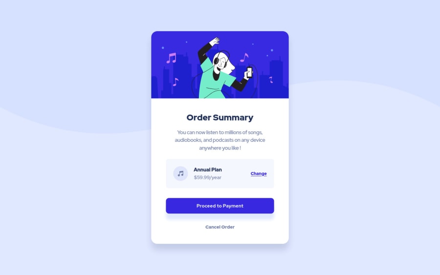
Design comparison
Solution retrospective
I used Flexbox for the layout, and coded with a mobile first approach.
Feel free to leave suggestions.
Community feedback
- @AdrianoEscarabotePosted about 2 years ago
Hi Virgil, how are you? I really liked the result of your project, but I have some tips that I think you will enjoy:
<p class="cancel" tabindex="0">Cancel Order</p>this element should be a
buttonsince it is associated with a functionality of the page, and there is no paragraph!To prevent the background image from breaking at higher resolutions, we can prevent this in two different ways:
-
Add a
background-repeat: repeat-x;, the image will repeat on the horizontal axis, preventing it from breaking. -
Add a
background-size: 100% 50vmin;, the50vminwill set its height as the page target, and100%will make it stretch on the horizontal axis.
Feel free to choose one of the two!
The rest is great!
I hope it helps... 👍
Marked as helpful0@virgile-labPosted about 2 years ago@AdrianoEscarabote Thanks a lot ! You're right about the button. About the background, I even didn't see the breaking. I made the changes !
0 -
Please log in to post a comment
Log in with GitHubJoin our Discord community
Join thousands of Frontend Mentor community members taking the challenges, sharing resources, helping each other, and chatting about all things front-end!
Join our Discord
