Submitted about 4 years agoA solution to the Order summary component challenge
Order Summary Card Solution
@gp0710

Solution retrospective
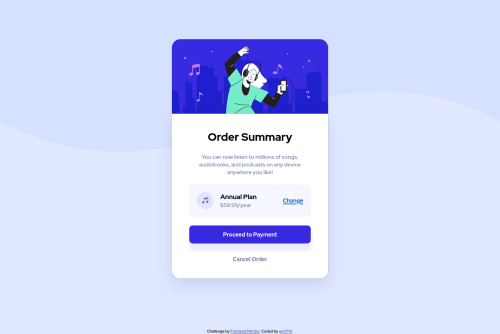
The background-image is one of the most confounding aspects of this project because the width really interferes with the responsiveness. I was wondering if anyone has any idea how to make the background image more mobile responsive, and how I can get my card to look like the way it does in the mobile version of the challenge.
Code
Loading...
Please log in to post a comment
Log in with GitHubCommunity feedback
No feedback yet. Be the first to give feedback on Gab's solution.
Join our Discord community
Join thousands of Frontend Mentor community members taking the challenges, sharing resources, helping each other, and chatting about all things front-end!
Join our Discord