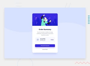
Design comparison
Solution retrospective
I would love feedback for my solution where I need to improve and level up
Community feedback
- @perezjprz19Posted almost 3 years ago
Overall, I think you did a good job of matching the design, but there were a few minor things I noticed:
I would also practice using naming conventions that are easier to understand.
I would suggest working to clear your accessibility report. They should be pretty simple fix, like adding a <main> tag and switching your back slashes with forward slashes.
While "pixel-perfect" or whatever some people are promoting is not required, you still do want to get as close to the design as possible. Besides, the more accurate your code the more you improve. Specifically, the hover color on the Proceed to Payment button as well as the font seem to be off. The shadow behind the button wasn't added. Like I said, minor stuff. In the case that you were having any issues with those things, or if you'd like to provide feedback:
You can check out my solution here: https://www.frontendmentor.io/solutions/order-summary-component-using-flexbox-5UlxZi3Kt
FYI: I added an outline to my cancel button because when I was tabbing to it with my keyboard, I couldn't tell that my focus was there.
Marked as helpful1@Dileep001Posted almost 3 years ago@perezjprz19 Thank you Jessica for the feedback I will update my mistakes and learn. and the border shadows will be updated soon
0
Please log in to post a comment
Log in with GitHubJoin our Discord community
Join thousands of Frontend Mentor community members taking the challenges, sharing resources, helping each other, and chatting about all things front-end!
Join our Discord
