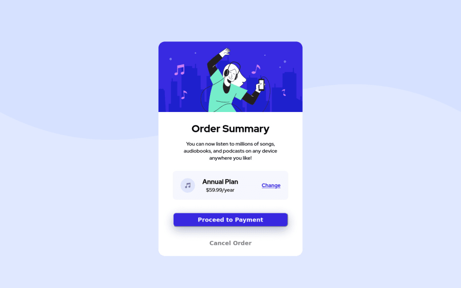
Design comparison
Solution retrospective
I think quite a few things I could have done better.
Instead of using a bunch of divs I could have used sections and gave the ID to them more meaning.
The button is not a link just the text and the font is too bold.
The button in the middle with the pricing I used a paragraph and a h2 instead of just using span.
Community feedback
- @markup-mitchellPosted over 3 years ago
Hi Garry,
It's good to be aware of the need for semantic tags, but I wouldn't get too hung up on adding
<section>s to this; arguably you could, but you should have a clear rationale for doing so, and understand the implications.You can improve your basic semantics/structure by looking at the issues flagged in the frontend mentor report. You can use a
<button>or (with due care) a<a>styled like a button, but not both.Some of these things depend on context. The markup you in a web app component will differ from that of webpage that's styled to look like a component, and it's not always clear from a design what the product is supposed to be!
Marked as helpful3@TalkingBaboonPosted over 3 years ago@markup-mitchell
Hello,
Will bear in mind what you said thanks for the comment much appreciated!
0
Please log in to post a comment
Log in with GitHubJoin our Discord community
Join thousands of Frontend Mentor community members taking the challenges, sharing resources, helping each other, and chatting about all things front-end!
Join our Discord
