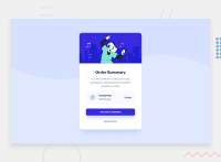
Design comparison
Solution retrospective
Hi!
Fourth project finished.
I suffered with this project, more than everything with the margin and padding of each one, I am happy with the result.
Also, any feedback is appreciated.
Goodbye! 👋
Community feedback
- @AdrianoEscarabotePosted about 2 years ago
Hi stiratto, how are you?
I really liked the result of your project, but I have some tips that I think you will enjoy:
To prevent the background image from breaking at higher resolutions, we can prevent this in two different ways:
-
Add a
background-repeat: repeat-x;, the image will repeat on the horizontal axis, preventing it from breaking. -
Add a
background-size: 100% 50vmin;, the50vminwill set its height as the page target, and100%will make it stretch on the horizontal axis.
Feel free to choose one of the two!
The rest is great!
I hope it helps... 👍
Marked as helpful1 -
Please log in to post a comment
Log in with GitHubJoin our Discord community
Join thousands of Frontend Mentor community members taking the challenges, sharing resources, helping each other, and chatting about all things front-end!
Join our Discord

