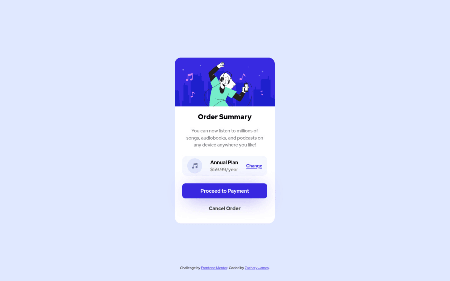
Design comparison
Solution retrospective
I finally found out how to center using left: 50%, top: 50;. Would love any additional feedback:)
Community feedback
- @DavidMorgadePosted over 2 years ago
Hello Zach! Good job finishing the challenge, congratulations !
- Centering things sometimes can get tricky and a lot of challenges here requires the component to be in the center of the screen, using
position: absolutein this case seems to not be a bad option since your component will stay responsive anyway, but for future cases, you can remove thepositionand center the content with flex in the body like this:
body {
    display: flex;
justify-content: center;
align-items: center;
height: 100vh;
flex-direction: column;
}
Also consider using
maintags, you are using adivwithsectionsinside, for this little project doesn't matter that much but you could have use amaintag instead of adiv!Hope my feedback helps you for future projects!
0 - Centering things sometimes can get tricky and a lot of challenges here requires the component to be in the center of the screen, using
- @vanzasetiaPosted over 2 years ago
Hi, Zach James! 👋
Congratulations on finishing this challenge! 🎉
I would recommend using flexbox or grid to position the card in the middle of the page. You can use the
bodyelement as the container of the card. Also, you need to setmin-height: 100vhto make the card vertically center. Withmin-height: 100vh, thebodyelement is still allowed to grow if ever needed.Absolute positioning can potentially introduce an overflow bug. Not only that, now we have flexbox and grid which is the modern way to deal with this. So, that's why I suggest using either flexbox or grid.
Some more suggestions from me.
- I suggest selecting the element in the CSS with its class name only. There's no need to increase the specificity by chaining the element. Also, it's best to use single class selectors for styling whenever possible
- I don't think you need to wrap the
buttonelements withformelement since there's nothing to be submitted. So, I recommend usingdivinstead.
That's it! I hope this helps!
0
Please log in to post a comment
Log in with GitHubJoin our Discord community
Join thousands of Frontend Mentor community members taking the challenges, sharing resources, helping each other, and chatting about all things front-end!
Join our Discord
