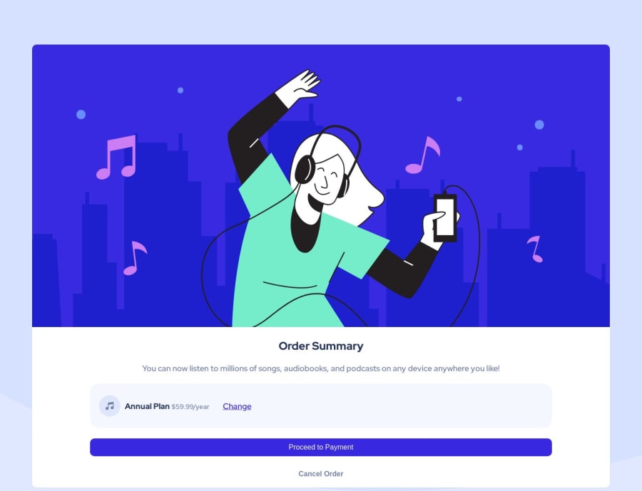
Design comparison
Solution retrospective
I was going to use buttons from the Bootstrap library in the code I wrote, but I gave up because I couldn't change their colors. I used flexbox.buildwithreact.
Community feedback
- @0xabdulkhaliqPosted over 1 year ago
Hello there 👋. Congratulations on successfully completing the challenge! 🎉
- I have other recommendations regarding your code that I believe will be of great interest to you.
HTML 🏷️:
- This solution may cause accessibility errors due to lack of semantic markup, which causes lacking of landmark for a webpage and allows accessibility issues to screen readers, due to accessibility errors our website may not reach its intended audience, face legal consequences, and have poor search engine rankings, highlighting the importance of ensuring accessibility and avoiding errors.
- What is meant by landmark ?, They used to define major sections of your page instead of relying on generic elements like
<div>or<span>. They are use to provide a more precise detail of the structure of our webpage to the browser or screen readers
- For example:
- The
<main>element should include all content directly related to the page's main idea, so there should only be one per page - The
<footer>typically contains information about the author of the section, copyright data or links to related documents.
- The
- So resolve the issue by wrapping the whole content using the proper semantic element
<main>in yourindex.htmlfile to improve accessibility and organization of your page
- Example:
<body>
<main>
  <img class="illustration" src="images/illustration-hero.svg" alt="">
  <h1> Order Summary</h1>

<p class="explanation">
  You can now listen to millions of songs, audiobooks, and podcasts on any
  device anywhere you like!</p>
<div class="price">

  <img style="margin-left: 20px;" class="icon-music" src="images/icon-music.svg" alt="">
  <p>
    <strong>Annual Plan</strong>
    <small>  $59.99/year</small>
  </p>
<a href="#" class="oneA">Change</a>
</div>
<button type="button" class="btn btn-first"> Proceed to Payment</button>
<button type="button" class="btn btn-second"> Cancel Order </button>

</main>
</body>
.
I hope you find this helpful 😄 Above all, the solution you submitted is great !
Happy coding!
Marked as helpful0 - @HassiaiPosted over 1 year ago
wrap the content of the html in the main tag to make the content/page accessible. click here for more on web-accessibility and semantic html
sample html:
<body><main> ---- the content goes here </main> </body>in the css, give the body a background-color of pale-blue, a background-image with a background-repeat of no-repeat and a background-size of contain.
there is no need to style the body, rather give the main a fixed max-width value for a responsive content.
max-width.To center the main on the page using flexbox or grid instead of using margin:
- USING FLEXBOX: add min-height:100vh; display: flex; align-items: center: justify-content: center; to the body
body{ min-height: 100vh; display: flex; align-items: center; justify-content: center; }- USING GRID: add min-height:100vh; display: grid place-items: center to the body
body{
min-height: 100vh;
display: grid;
place-items: center;
}
Use relative units like rem or em as unit for the padding, margin, width values and preferably rem for the font-size values, instead of using px which is an absolute unit. For more on CSS units Click here and here
in the media query you only have to change the background-image of the main
Hope am helpful.
Well done for completing this challenge. HAPPY CODING
Marked as helpful0
Please log in to post a comment
Log in with GitHubJoin our Discord community
Join thousands of Frontend Mentor community members taking the challenges, sharing resources, helping each other, and chatting about all things front-end!
Join our Discord
