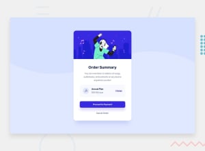
Design comparison
Solution retrospective
-Is the code written as elegantly/clean as it can be?
-Is there a better way of doing things than what I opted for?
Any comments, advice, insight etc. is appreciated. Thank you!
Community feedback
- @byronbyronPosted almost 3 years ago
I agree with the above from David.
I think the three <section> elements are a bit unnecessary. If anything, the whole card would be in a section, but I don’t even think that’s necessary, in this case. https://developer.mozilla.org/en-US/docs/Web/HTML/Element/section
1 - @brodiewebdtPosted almost 3 years ago
Your solution looks good. You don't need to add all that @font-face code in the CSS. Go to Google fonts, select the typeface and the weights you want and put the link in the head of the document. Then just add the font-family code to the body selector. Another thing you should do is use rem and em units instead of pixel values. Rems and Ems are responsive, pixels aren't. Hope this helps.
1@vanzasetiaPosted almost 3 years ago@brodiewebdt As far as I know, using a local font or
@font-facehas no bad impact on users. I agree that this might look overkill and a lot of code to write, but it has several benefits:- It allows the browser to choose the best and supported format possible, which now the
woff2is the best format. But thewoff2format is not supported by the older browsers like IE and old browser versions. So, the older browsers can choose different font file types. - (Might happen(?)), if for some reason the google fonts site is down, then the local font will save the day.
0@brodiewebdtPosted almost 3 years ago@vanzasetia I was looking at it as the amount of code to write. I can't speak to the load impact.
0 - It allows the browser to choose the best and supported format possible, which now the
- @vanzasetiaPosted almost 3 years ago
👋 Hi there!
I have some feedback on this solution:
- Accessibility
- About the HTML markup, that's right what Byron has said. You don't need three
sectiontags, since thosesectiontags will be treated asdivtags, which means that you can just swap the section withdivtags. - For the
@font-face, In my opinion, is OK. Since the modern browsers will only download thewoff2version, while older browsers will download another type instead. - 👍 Good job on handling all images!
- Create a custom
:focus-visiblestyling to any interactive elements (button, links,input,textarea). This will make the users can navigate this website using keyboard (Tab) easily. - Always wrap the text with a meaningful tag, such as
p(in this case). Only usespanordivfor styling purposes. - I would recommend adding
type="button"to prevent some browsers from submitting any information. - Use
remor sometimesemunit instead ofpx. Usingpxwill not allow the users to control the size of the page based on their needs. - Don't limit the height of the
bodyelement, it will not allow the users to scroll the page if the page content needs moreheight. Usemin-heightinstead.
- About the HTML markup, that's right what Byron has said. You don't need three
- Best Practice
- I would not recommend using the non-standard CSS properties, since it has bad browser compatibility. Here, I'm talking about the
zoomproperty. I'm afraid that different browsers may treat it differently which can lead to an unexpected result.
- I would not recommend using the non-standard CSS properties, since it has bad browser compatibility. Here, I'm talking about the
That's it! Hopefully, this is helpful!
0 - Accessibility
Please log in to post a comment
Log in with GitHubJoin our Discord community
Join thousands of Frontend Mentor community members taking the challenges, sharing resources, helping each other, and chatting about all things front-end!
Join our Discord
