Design comparison
Solution retrospective
All feedback is welcome.
Community feedback
- @code-eliasPosted over 2 years ago
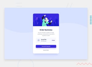
Hi Adriel, Your solution is a bit different from the original design, but I don't think it looks bad at all. I would only suggest to create some additional spacing between the various elements. In particular the "Annual Plan" from the buttons below.
In terms of accessibility, I think always adding an alt to your images is just a good habit to get into. I know this is just a small challenge, but it's always good to put it. Even something simple like "Dancing person".
I don't know if this design showed a mobile version, but just letting you know that the card compresses very strangely on smaller screens. Responsive design is a pretty big argument, but some starter tips are generally to avoid vw for width, and instead using a combination of margins and max-width to avoid strange stretching and compression of your elements.
Hope this is helpful, otherwise great job and keep it up!
Marked as helpful0
Please log in to post a comment
Log in with GitHubJoin our Discord community
Join thousands of Frontend Mentor community members taking the challenges, sharing resources, helping each other, and chatting about all things front-end!
Join our Discord
