Design comparison
Solution retrospective
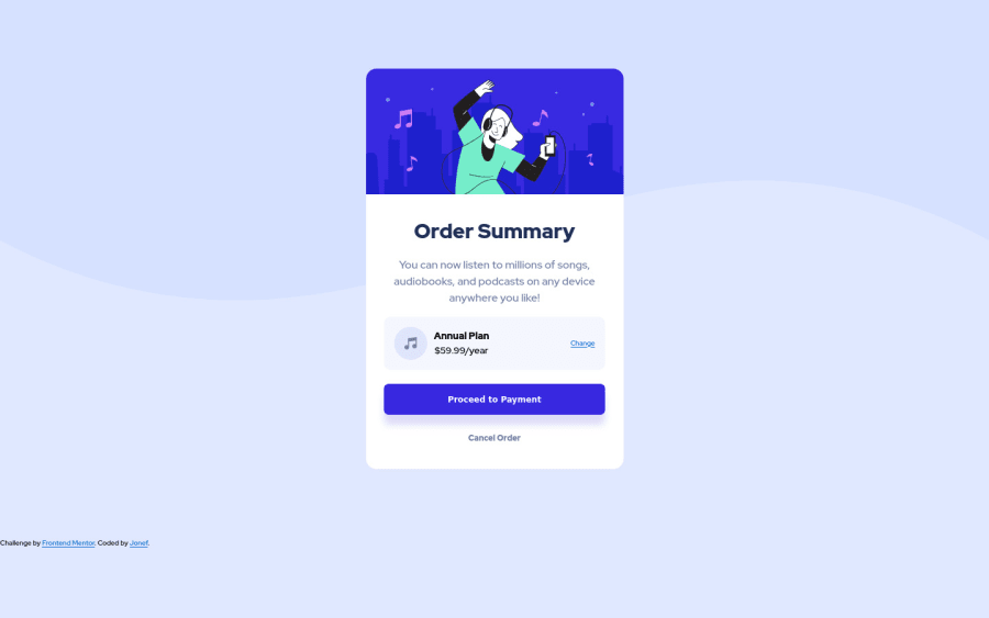
When the buttons get active, the size increases and it is also increasing the size of whole card. Should it be like that?
Community feedback
- @itadori-kunPosted about 2 years ago
Hello JorgeNevesFreitas Great work. Regarding your question,
-
There are two different font-sizes and font-weight on your #checkout-buttons__proceed and the hover state. The weight and font-sizes should only be placed on the #checkout-buttons__proceed state. The hover state inherits the normal state.
-
You only wrote the code for the .checkout-preview__change a: hover state and not the .checkout-preview__change a state. Apply point 1. when editing and should help.
Happy coding
0@JorgeNevesFreitasPosted about 2 years ago@itadori-kun Oh. I thought the font-sizes were bigger in the hover. Fixed that.
Thank you very much for the help
0 -
Please log in to post a comment
Log in with GitHubJoin our Discord community
Join thousands of Frontend Mentor community members taking the challenges, sharing resources, helping each other, and chatting about all things front-end!
Join our Discord