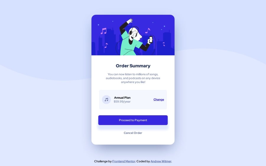
Design comparison
Solution retrospective
This was my first time using media queries, and I feel like I didn't nail the scaling of some of the card elements. Specifically, <div class="payment-plan"> (line 29) didn't scale down as I shrunk the view smaller than the 375px for mobile. Is there a better way to do it than how I did?
Community feedback
- @NombiembrePosted about 1 year ago
Hello, Nice job, you really nailed the look!
In this challenge theres no need to use media queries (maybe only to change the background image to mobile)
The class payment-plan doesn't shrink right because it does not has a max-width so it just overflows, but, don't add a max-width, there's a better solution and it is in how you structure your index.html
In your main card you used three div's, one for the "header", the second one for the payment, another for the button, if you look close, is better to just use two div's, one for the image, and the other one for the content itself, here put a max-width of the girl image width, and that should fix the line 29 error.
In the second div where is your content you just add a padding and a display grid to add a gap and therefore, a margin between elements. Theres a channel i highly recommend for css and is called Kevin Powell, also, heres a video of a similar challenge using only two div's
Great job on your project, and keep up the excellent work! 👍
0
Please log in to post a comment
Log in with GitHubJoin our Discord community
Join thousands of Frontend Mentor community members taking the challenges, sharing resources, helping each other, and chatting about all things front-end!
Join our Discord
