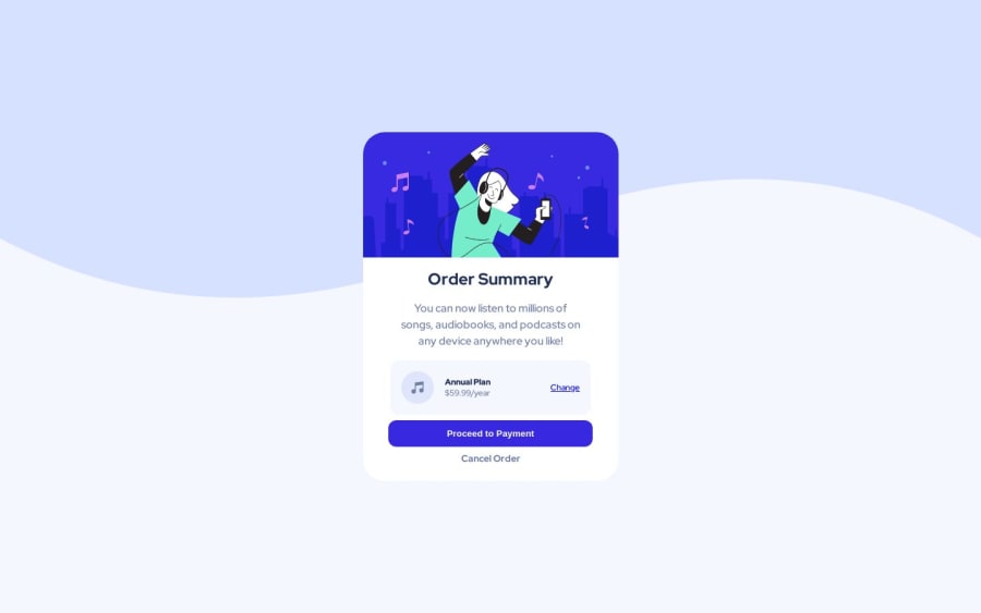
Design comparison
Solution retrospective
The active state color codes aren't provided in the style guide, that took a little trial and error to get it close
Community feedback
- @0xabdulkhaliqPosted over 1 year ago
Hello there 👋. Congratulations on successfully completing the challenge! 🎉
- I have other recommendations regarding your code that I believe will be of great interest to you.
BACKGROUND iMAGE 📸:
- The
background-imagehas not been properly set yet, So let me explain How you can easily apply thebackground coloralong with thesvgthey provided.
- Add the following style rule to your css, and then experience the changes
body {
    background: url(./images/pattern-background-desktop.svg), #E1E9Ff;
    background-repeat: no-repeat, no-repeat;
}
- Tip, Don't forget to generate a new screenshot after editing the
cssfile
.
I hope you find this helpful 😄 Above all, the solution you submitted is great !
Happy coding!
1@Durban86Posted over 1 year ago@0xAbdulKhalid Thanks for your help, but this didn’t work, I just changed the background size to contain instead of cover in my current code.
0 - @HassiaiPosted over 1 year ago
The body has a wrong background-color, give it a background of pale-blue
For a responsive content, replace the width of .container with
max-widthand increase its value.max-width:432px which is 27remUse relative units like rem or em as unit for the padding, margin, width values and preferably rem for the font-size values, instead of using px which is an absolute unit. For more on CSS units Click here
for the active status give it the button opacity:0.5
you forgot to give the button a box-shadow value and give it a color hsla(245, 75%, 52%, 0.2)
Hope am helpful.
Well done for completing this challenge. HAPPY CODING
0
Please log in to post a comment
Log in with GitHubJoin our Discord community
Join thousands of Frontend Mentor community members taking the challenges, sharing resources, helping each other, and chatting about all things front-end!
Join our Discord
