Not Found
Not Found
Not Found
Not Found
Not Found
Not Found
Not Found
Not Found
Not Found
Not Found
Not Found
Not Found
Not Found
Not Found
Not Found
Not Found
Not Found
Not Found
Not Found
Not Found

Submitted

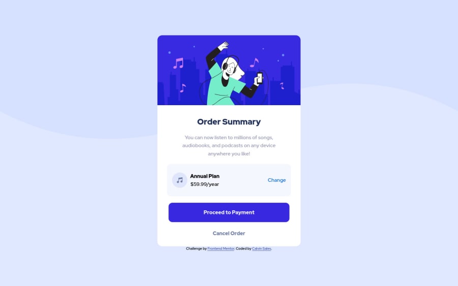
Order Summary Card Component using HTML, CSS Flex

@NoobKelvin

Desktop design screenshot for the Order summary component coding challenge

This is a solution for...

  • HTML
  • CSS
1newbie
View challenge

Design comparison


SolutionDesign

Solution retrospective


Took me a lot of time to figure this out. The hardest part for me is figuring out how to make the website mobile responsive. I know there's a lot for me to learn so suggestions are highly appreciated :) .

Community feedback

Vanza Setia 27,795

@vanzasetia

Posted

Hi, CalvinSales! 👋

For the responsiveness of the site, the card only needs a max-width and you should remove max-width: 100%. After that, add some padding to the <body> element to prevent the card from filling the entire viewport.

The illustration and music icon are decorative images. So, leave the alternative text empty.

For your information, decorative images are images that don't add any information and serve only aesthetic purposes.

I hope you find this useful. Happy coding! 😄

1

@salmafadlabdulrahman

Posted

Hello there, great job working on this project👏 I had the same problem when I first started building projects, I struggled to make my website responsive, but with practicing it's getting easier now, I have a resource for you that might help, there's a course called "Learn Responsive web design" on scrimba.com, I encourage you to take it. I took the course myself and it was helpful and I got the chance to practice on some projects.

1
Hassia Issah 50,670

@Hassiai

Posted

Replace ,h4> with <h2> to fix the accessibility issue.

To center .order on the page using flexbox instead of a margin, add min-height:100vh; display: flex; align-items: center: justify-content: center; to the body.

To center .order on the page using flexbox:
body{
min-height: 100vh;
display: flex;
align-items: center;
justify-content: center;
}

There is no need to style the main and to give .order overflow: hidden.

Use relative units like rem or em as unit for the padding, margin and width values, instead of using px which is an absolute unit. For more on CSS units Click here

Hope am helpful.

Well done for completing this challenge. HAPPY CODING

1

Please log in to post a comment

Log in with GitHub
Discord logo

Join our Discord community

Join thousands of Frontend Mentor community members taking the challenges, sharing resources, helping each other, and chatting about all things front-end!

Join our Discord