Design comparison
Solution retrospective
I would like to get feedback on this project
Community feedback
- @pikapikamartPosted about 3 years ago
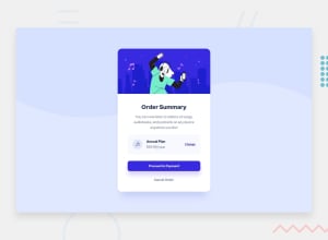
Hey, awesome work on this one. Layout is fine but the image is different right, I think it is intentional right.
Jasper Decaestecker already gave feedback on this one, just going to add some suggestions as well:
- Never use
position: absoluteon a large element as this removes the element from the flow. Try to inspect the layout, hover on thehtmlorbodytag, you will notice that it doesn't have any height since the layout inside it is out of the flow. - Since you are using
positionto center the layout, you can do it this way, but first remove these stylings on the.cardelement:
position
absolute
left
padding-bottom # use the padding-bottom on the body tag
and on the
bodytag add these:align-items: center; display: flex; justify-content: center; min-height: 100vh;This way, content will be centered properly and you avoided using
position.- Always have a
mainelement to wrap the main content of your page. On this one, the.cardshould be using themaininstead ofdiv. - When using
imgtag, don't forget to include thealtattribute, even if the value of it is empty or not. If you don't include this, screen-reader will read the source path of theimgwhich you don't want. So always include it. - A page must have a single
h1on a page. Since there are no text-content that are visible that could beh1, you will make theh1screen-reader only text. Meaning this will be hidden for sighted users and only be visible for screen-reader users, search aboutsr-onlystylings and see how it is used. Theh1text should describe what is the main content is all about, thish1would be placed as the first text-content inside themainelement. - Avoid using
idattribute as a selector in css because it is a bad practice due to css specificity. Useclassto target elements. annual plancould use a heading tag since it gives information on what the section would contain.- Always use interactive elements such as
buttonoratag for interactive components, usingptag on thechangemakes it not accessible.
Aside from those, great work again on this one.
Marked as helpful0 - Never use
- @jasperdecaesteckerPosted about 3 years ago
Hey, I think the spacing in the plan (Annual plan) is not that great, i would add more padding to give your solution more breathing space, like in the design I would also look to have the primary button (Proceed to payment) to be larger visually than cancel order, Cancel order draws more attention now i feel.I do like to overall.
I like that you gave your own twist with it (image and some color changes) it does look good.
Marked as helpful0
Please log in to post a comment
Log in with GitHubJoin our Discord community
Join thousands of Frontend Mentor community members taking the challenges, sharing resources, helping each other, and chatting about all things front-end!
Join our Discord
