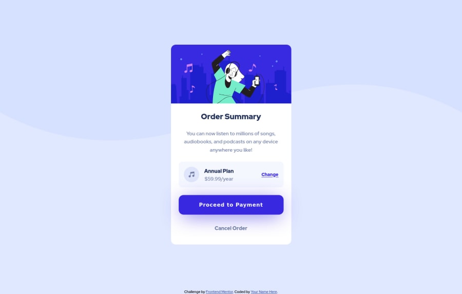
Submitted about 2 years ago
Order summary card challenge using HTML and CSS
@alanacapcreates
Design comparison
SolutionDesign
Community feedback
- @correlucasPosted about 2 years ago
👾Ciao Alana Caporale, congratulations for your new solution!
I've cheked your solution and I tried to understand how can we make it more responsive, here's my tips for you Alana:
To make the component more responsive you need to fix some elements, for example, the button needs
max-width: 100%instead ofwidth: 100%and so the image need some work around, add these properties to have flexible images:img { display: block; object-fit: cover; max-width: 100%; }A Media query to make the pricing section separated by rows:
@media (max-width: 340px) {
.plan-details {
    flex-direction: column;
}
}
👋 I hope this helps you and happy coding!
0
Please log in to post a comment
Log in with GitHubJoin our Discord community
Join thousands of Frontend Mentor community members taking the challenges, sharing resources, helping each other, and chatting about all things front-end!
Join our Discord
