Submitted over 3 years ago
Order summary card challenge - flexbox,border-radius,object-fit
@xsrpm
Design comparison
SolutionDesign
Solution retrospective
your feedback about pixel perfect is appreciated :D!
Community feedback
- @TulipSoupPosted over 3 years ago
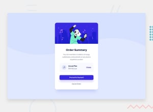
Hi there! Good! Really close to the design :) If you're looking for pixel-perfect feedback, I would suggest to look more carefully the space between elements inside de Annual plan box.
-
The music icon should have the same margin top, bottom and left.
-
The text "Annual Plan" should be closer to the music icon.
-
And the color of the title is Dark Blue, not Black. It's really subtile but it makes the difference :)
Marked as helpful1 -
Please log in to post a comment
Log in with GitHubJoin our Discord community
Join thousands of Frontend Mentor community members taking the challenges, sharing resources, helping each other, and chatting about all things front-end!
Join our Discord
