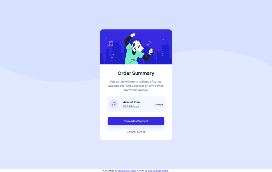
Design comparison
Solution retrospective
Feel Free to provide your feedback!
Community feedback
- @shashreesamuelPosted about 3 years ago
Hey someshwari-rudra good job completing this challenge. Keep up the good work
Your solution looks great however I think the card button and the card itself is missing a subtle box-shadow. You can achieve this using the
box-shadowproperty.In addition I recommend starting to use html semantic tags in your code. It will improve the quality and get rid of these accessibility issues
Read more on semantic tags here
https://www.w3schools.com/html/html5_semantic_elements.asp
In terms of your accessibility issues, simply wrap all your content between
<main>tags to get rid of all issues.I hope this helps
Cheers Happy coding 👍
Marked as helpful1
Please log in to post a comment
Log in with GitHubJoin our Discord community
Join thousands of Frontend Mentor community members taking the challenges, sharing resources, helping each other, and chatting about all things front-end!
Join our Discord
