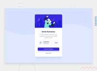
Design comparison
Solution retrospective
All suggestions are welcome.
Feel free to reach out
Community feedback
- @MelvinAguilarPosted about 2 years ago
Hi @joaovitorwitt 👋, good job on completing this challenge! 🎉
I like this solution for the challenge. Here are some suggestions you might consider:
- The music icon and the illustration are for decoration purposes only, so they could be hidden from screen readers by adding aria-hidden="true" and leaving its alt attribute empty:
<img src="./images/icon-music.svg" alt aria-hidden="true">- Use an h1 tag for your solution. The
<h1>element is the main heading on a web page. There should only be one<h1>tag per page, and always avoid skipping heading levels; Always start from<h1>, followed by<h2>, and so on up to <h6> (<h1>,<h2>,...,<h6>). The HTML Section Heading elements (Reference)
Solution:
<h1>Order Summary</h1>I hope those tips will help you.
Good job, and happy coding!
Marked as helpful1 - @AdrianoEscarabotePosted about 2 years ago
Hi joaovitorwitt, how are you?
I really liked the result of your project, but I have some tips that I think you will enjoy:
To prevent the background image from breaking at higher resolutions, we can prevent this in two different ways:
-
Add a
background-repeat: repeat-x;, the image will repeat on the horizontal axis, preventing it from breaking. -
Add a
background-size: 100% 50vmin;, the50vminwill set its height as the page target, and100%will make it stretch on the horizontal axis.
Feel free to choose one of the two!
The rest is great!
I hope it helps... 👍
Marked as helpful0 -
Please log in to post a comment
Log in with GitHubJoin our Discord community
Join thousands of Frontend Mentor community members taking the challenges, sharing resources, helping each other, and chatting about all things front-end!
Join our Discord

