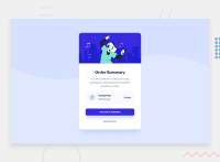
Design comparison
SolutionDesign
Solution retrospective
All feedback is welcome. Also, how can I center the content just like it is in the design
Community feedback
- @ChamuMutezvaPosted about 3 years ago
Nice work, well done. Work on the styling for mobile especially for devices less than 375px. Try adding
max-widthto themainelementmain { width: 375px; height: 520px; margin: 2em auto 7em; max-width: 90%; //add this so that if the width is less than 375px then the width will be 90% of the container . That will prevent the main content from being cut off the display }1@SirJhay3Posted about 3 years ago@ChamuMutezva thanks a lot. I'd include that my implementation
0 - @hafizanadliPosted about 3 years ago
For better responsiveness, try avoid using absolute value. Better to use relative value (%, vw, etc.). And also play with media queries.
Great job!
1@SirJhay3Posted about 3 years ago@hafizanadli thanks a lot. I didn't see the need for media queries though because the design was the same for both screens
1
Please log in to post a comment
Log in with GitHubJoin our Discord community
Join thousands of Frontend Mentor community members taking the challenges, sharing resources, helping each other, and chatting about all things front-end!
Join our Discord

